The observer usually takes note of the visual hues first while looking at an artist’s work. Therefore, the choice of color by the artist can significantly influence the viewer’s perception of an artwork. The same is true of Camille Pissarro.
For most of his life, Pissarro painted in the impressionist style. The environment frequently impacted the compositions he was working in and how the ambient light, shadows, color, and weather changed. He was open to experimenting with different working methods and frequently found inspiration in his coworkers and mentors.
About Painter Pissarro
Pissarro was born in St. Thomas but spent years studying in France before relocating to Paris in 1855. He also briefly lived in Caracas. Pissarro had studied under Camille Corot and Anton Melbye in his early years.
Their aesthetic affected some of Pissarro’s subject selections; according to Rothkopf, these were often “modest landscapes, farm scenes, and portraits.” Pissarro’s impressionist paintings strongly connected to nature, and he used color to depict how light and shadow affected his immediate surroundings.
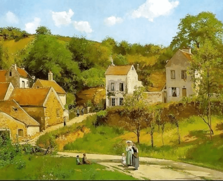
Consider one of his works, Banks of the Marne. This is one of the few works from the list of Camille Pissarro most famous painting “for which there is a surviving oil sketch.” Here, the observer can see Pissarro’s progression from a “study” to a finished product.
He depicts light falling on the walkway, the sun’s shine behind the tree, and the shadows that darken the hillside, which displays his “passion in atmosphere and shadow.” Here, he uses light tans, greens, and whites to portray the light that has fallen and darker earth tones to represent the darkness. A lot of the time, Pissarro chooses realistically appropriate colors, given the nature of his subjects.
How Did Camille Pissaro Use Vivid Colors in His Paintings?
Painter Pissarro was one of the best impressionists of his time. The art movement known as Impressionism, which began in Paris in the middle of the 1800s, employed color to depict many types of light.
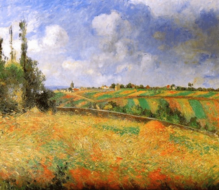
Pissaro’s work favors “harmonious, close valued hues.” Later, he wanted to attempt something different, so he made his paintings more realistic by using vivid colors and evenly spaced-brush strokes. Finally, he focused on tone and texture in his Pissarro landscape paintings.
French Impressionist Pissarro was curious about how color, shadow, and light affected his paintings. The legendary Pissaro achieved fame at the time due to his methods, however unorthodox they seemed.
Camille Pissaro’s Sources of Inspiration
Pissarro mostly took inspiration from American novelist Celen Sabbrin. “The cautionary hand keeps the soul from rushing to her death, and nature doesn’t set any hurdles in her path,” she wrote. He used social injustice and the environment as motifs in his paintings. Additionally, he finds inspiration in his friends and coworkers. Because of his achievements at the time, Camille Pissarro successfully used color in his paintings.
Artist Pissarro sought to experiment with utilizing more vivid colors in his paintings around the middle of the 1800s. Pissarro used vibrant colors in addition to great tonal contrast. For instance, Montfoucault used colors of a comparable scale in his landscape paintings.
Black, blue, green, white, and yellow served as the theme color for both “The Montfoucault Harvest” and “The Montfoucault Pear Tree.” You may see some of the pure primary colors, such as blue and yellow, in the paintings. He also enjoys mixing colors and demonstrating how it looks when it’s done. His depiction of Montmartre Boulevard demonstrates his attempt to convey the briskness of the air.
He employed oil paint and short stabbing brushstrokes to achieve accurate color and texture in several of his Pissarro landscape drawings. Titanium white, yellow ochre, cadmium yellow, deep madder, viridian green, ultramarine blue, and burnt umber made up Pissarro’s color scheme. Typically, he uses few colors in his paintings. Instead, he just used primary and secondary hues.
Pissaro received criticism for using color but did not alter his behavior. Instead, he defended it. Pissarro’s biographers admit that his late 19th-century artwork was disturbing, even dubious. No wonder this led to the failure of his first exhibition in 1883.
He created a novel way to enhance his works. He employed a technique known as “tiny dabs of juxtaposed color” rather than sprinkling brushstrokes. In this manner, he would produce a dazzling effect. In his painting of the “Peasants dwellings, Eragny Maisons de paysans,” he experimented with this method. The artist made use of tiny dots and vivid hues in his work.
Caille Pissaro’s Collaborations With Other Artists
Pissarro was a creative who was willing to experiment with new trends as they appeared. When the art of the time evolved, he would give various ideas a try, eventually returning to Impressionism and neo-impressionism. He accepted the teachings of Melbye and Corot. He collaborated with other painters of the time, including Monet, Cézanne, Renoir, and others.
It was amazing to witness Camille Pissarro’s distinct and beautiful style. He played a significant part in the mid-1800s Impressionism movement. Pissarro’s use of color helped to make his concepts come to life.
Pissarro’s use of vivid colors and brushstrokes (thickly coated paint and brief probing strokes) drew everyone’s attention in his day and the contemporary art world. Due to his incredible skills, he is one of the most significant artists we had during the impressionist period. His painting techniques and abilities are still in use.
Conclusion
Pissarro was unquestionably at the center of everything Impressionist. He collaborated with other impressionist painters of the day, and the two organized the opening of the first Impressionist exhibition in Paris.
The famous Pissaro used bright colors to capture the scene’s natural impacts of weather and natural light. Even later, he always opted to try out new things and frequently embraced pointillism. Pissarro was generally considered to be his critic and still is. He painted attractively, adhering to tradition, just like the masters, and had a broad and firm range of touch.
Your article helped me a lot, is there any more related content? Thanks! https://www.binance.com/pl/join?ref=OMM3XK51
Thank you for your sharing. I am worried that I lack creative ideas. It is your article that makes me full of hope. Thank you. But, I have a question, can you help me?
I don’t think the title of your article matches the content lol. Just kidding, mainly because I had some doubts after reading the article.
mexico pharmacies prescription drugs: online mexican pharmacy – mexican mail order pharmacies
medication from mexico pharmacy
https://cmqpharma.online/# mexican drugstore online
buying from online mexican pharmacy
hey there and thank you for your information – I have definitely picked
up something new from right here. I did however expertise several technical issues using this
site, since I experienced to reload the website many times previous to I could get
it to load properly. I had been wondering if your web hosting is OK?
Not that I’m complaining, but sluggish loading
instances times will very frequently affect your
placement in google and could damage your quality score if advertising and marketing with Adwords.
Well I’m adding this RSS to my email and could look out for much more of
your respective interesting content. Make sure you update this
again soon.. Escape room
Very interesting info!Perfect just what I was looking for!?
best online pharmacies in mexico: mexican pharmacy online – mexico drug stores pharmacies
buying from online mexican pharmacy
https://cmqpharma.com/# п»їbest mexican online pharmacies
buying prescription drugs in mexico online
canadian pharmacy world: canadian pharmacy review – legitimate canadian pharmacies
legitimate canadian mail order pharmacy: canada pharmacy online – reputable canadian pharmacy
mexican pharmacy purple pharmacy mexico price list mexico drug stores pharmacies
https://indiapharmast.com/# buy prescription drugs from india
pharmacy website india: india pharmacy mail order – indianpharmacy com
cheapest online pharmacy india mail order pharmacy india Online medicine order
п»їlegitimate online pharmacies india: indian pharmacy paypal – india pharmacy
my canadian pharmacy: my canadian pharmacy rx – my canadian pharmacy rx
https://canadapharmast.online/# safe canadian pharmacy
pharmacies in mexico that ship to usa: mexican border pharmacies shipping to usa – buying from online mexican pharmacy
reputable indian online pharmacy: top online pharmacy india – buy prescription drugs from india
canadian pharmacy meds safe canadian pharmacies canadian pharmacy meds reviews
best canadian pharmacy online: safe canadian pharmacy – canadian neighbor pharmacy
https://canadapharmast.com/# canadian online pharmacy
the canadian pharmacy: canada cloud pharmacy – legal canadian pharmacy online
canadian pharmacy mall: reliable canadian online pharmacy – best canadian pharmacy
This website was… how do I say it? Relevant!! Finally I’ve found something which helped me. Cheers.
indian pharmacies safe п»їlegitimate online pharmacies india mail order pharmacy india
buying prescription drugs in mexico online: mexico pharmacies prescription drugs – purple pharmacy mexico price list
I could not resist commenting. Perfectly written!
https://ciprodelivery.pro/# cipro pharmacy
paxlovid buy: Paxlovid over the counter – paxlovid for sale
Hi, I do think this is a great website. I stumbledupon it 😉 I may revisit once again since I book marked it. Money and freedom is the best way to change, may you be rich and continue to guide others.
http://ciprodelivery.pro/# buy cipro
I like reading a post that can make men and women think. Also, thanks for allowing me to comment.
where to buy doxycycline 100mg: buying doxycycline online in usa – doxycycline mono
http://clomiddelivery.pro/# can you buy cheap clomid without insurance
Very good information. Lucky me I found your blog by accident (stumbleupon). I have saved it for later!
https://amoxildelivery.pro/# amoxicillin capsule 500mg price
amoxicillin medicine: amoxicillin 500 mg tablet – amoxicillin 500mg prescription
http://amoxildelivery.pro/# amoxicillin discount coupon
An intriguing discussion is definitely worth comment. I do think that you should publish more on this subject, it may not be a taboo subject but generally people don’t speak about such topics. To the next! Many thanks!
Everything is very open with a really clear description of the challenges. It was truly informative. Your website is very helpful. Thank you for sharing.
cipro online no prescription in the usa: ciprofloxacin 500 mg tablet price – cipro for sale
https://paxloviddelivery.pro/# paxlovid buy
There’s definately a lot to learn about this topic. I like all the points you have made.
https://paxloviddelivery.pro/# paxlovid india
It’s nearly impossible to find well-informed people on this topic, however, you sound like you know what you’re talking about! Thanks
buy cipro without rx: ciprofloxacin – ciprofloxacin order online
Hi there, I do think your website may be having internet browser compatibility issues. When I look at your website in Safari, it looks fine but when opening in I.E., it’s got some overlapping issues. I merely wanted to provide you with a quick heads up! Aside from that, wonderful site!
http://ciprodelivery.pro/# п»їcipro generic
https://clomiddelivery.pro/# buying clomid
how to buy generic clomid no prescription: how can i get cheap clomid without a prescription – cost cheap clomid online
ciprofloxacin over the counter: where to buy cipro online – buy cipro
I’d like to thank you for the efforts you’ve put in penning this site. I am hoping to view the same high-grade content from you later on as well. In truth, your creative writing abilities has encouraged me to get my own site now 😉
An impressive share! I have just forwarded this onto a colleague who had been doing a little research on this. And he in fact bought me lunch because I stumbled upon it for him… lol. So allow me to reword this…. Thanks for the meal!! But yeah, thanks for spending the time to discuss this subject here on your site.
Howdy! This blog post could not be written any better! Looking through this article reminds me of my previous roommate! He constantly kept talking about this. I will send this article to him. Pretty sure he’s going to have a very good read. Thanks for sharing!
I used to be able to find good info from your blog articles.
I really like it when individuals come together and share thoughts. Great blog, continue the good work.