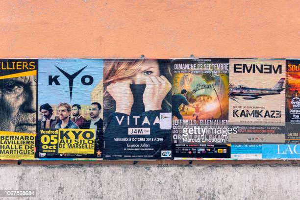
Are your posters not attracting attention? The market size of the Graphic Designers industry is expected to increase by 1.2% in 2023.
You want to make your poster stand out to increase its reach. Failure to do so can result in low traffic and wasting your advertisement or marketing budget.
Knowing how to avoid common errors in poster designs can help you achieve the outcomes you desire. But how do you achieve great-looking posters that people will pay attention to?
Read on to learn what you should avoid and how you create the right poster design for your needs.
- Too Much Text
Posters with a lot of text overwhelm viewers, meaning you lose the message, and miss the poster’s purpose. To avoid this mistake, keep the text to a minimum. Use brief, clear, and straightforward phrases.
Less is more when it comes to text on posters, so don’t try to squeeze in every piece of information. For more info, you can use a quote poster maker to create attractive and precise posters without struggling with text only.
- Unreadable Font
Fonts should be large enough to read from a distance, and users should pay attention to the spacing between characters. The business poster size font and type should contrast with the background of the poster, ensuring that all the text on posters can be read easily.
When choosing fonts, opt for plain typefaces; these are easier to read. Sans serif fonts are also more readable and work better for posters.
- Outdated Themes
Posters that use old fonts, colors, and graphics give the impression of being outdated or out of style and can detract from the overall message of the poster. To avoid this issue, designers should research trends and styles in the industry and create posters that use current and up-to-date colors, fonts, and graphics. Additionally, ensuring that designs are clean and straightforward can help keep a poster from looking outdated.
- Poor Color Contrast
When a poster design lacks color contrast, it can appear disorganized and unappealing. To prevent a poster color contrast from appearing dull and low-key, use a contrasting color palette, such as light and dark hues or contrasting warm and cool colors. Try varying the saturation of colors within the same color palette to add depth and visual interest.
- Low Resolution Images
Low-resolution images on posters are unsmooth and pixelated due to having a low DPI (dots per inch) number. They tend not to be as clear, lead to harsher colors, and can cause distorted images. To avoid this, use higher-resolution images with higher DPI numbers to be sharper and more pleasing.
- Poor and Cluttered Design
Poor and cluttered design can cause confusion, make details difficult to read, and fail to create an impact. To avoid poor and cluttered design, skip adding too many elements in one design, stick to one to two main focus points, and use high-quality images. Stick to a clear hierarchy, using scale and space to ensure your messaging is easy to identify and read.
Avoid These Common Errors in Poster Designs
It’s important to keep common mistakes in mind when designing posters to ensure your message is conveyed. Common errors in poster designs to avoid are too much text, unreadable font, outdated theme, poor color contrast, low-resolution images, and poor and cluttered design. Working with a professional can ensure that your poster is as effective and eye-catching as possible.
So don’t delay. Take advantage of these poster design ideas to avoid common errors and optimize your next poster design!
To get loads of helpful advice, check out the rest of our blog!

